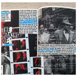
letters

“
Imperfection is beauty,
Madness is genius and
it’s better to be absolutely
ridiculous than
absolutely boring.
_ Marilyn Monroe
“
Stories,
Are build by words.
Words,
are built by letters.
Typography,
it’s the art of arranging letters.
Typography.
Fonts and structure.
Weights and widths.
Kerning and spacing.
Serif.
Sans-serif.
Mono-space.
Handwritten.
Exploring new fonts
a fun rabbit hole.
It’s where the journey starts.
Towards readability.
To hit the right feel.
Or lift a message.
A broken stamp.
Unreadable text.
Old wooden letters for a letterpress.
Special designed letters,
for better readibility when online.
Typography brings life to words.
Some g’s, a’s or f’s are pure art in itself.
Yes,
a B has to be right.
as has the c, the d, de e…
even the little dot on the i
most have the right fit
to the right visual feel.
Yes,
I can dive deeper
into the rabbit hole of fonts
if one letter is off.
Geeky?
Maybe.
Boring?
Ridiculous?
Love runs deep.