battle of the beach | waternet | enthusiasm given clarity
At Waternet in Amsterdam,
a water management utility company.
there was a story on the Dutch dikes
part of an educational programme.
Presented by powerpoint,
to pupils of elementary school,
by this wonderful man.
Enthusiasm on the topic,
beaming from all of him.
The presentation had grown too big.
Around thirty slides for ten year olds.
A bit too much that is.
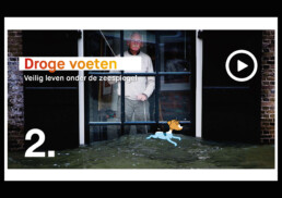
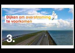
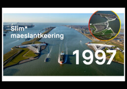
Getting the story back to ten slides,
telling it visually
and re-designing the logo
to a better fit for those nearly teens.
Closing the communication gap,
in your story,
re-story it visually,
it lits my fire.
Clarity,
see-ing the story differently,
and new possibilities,
a new way of connecting
is what I bring.
And that water thing?
It’s a love that doesn’t shrink.
Being raised between clear water,
a lot of fresh air and wind.
It’s fairness and airness weaves throughout
my thoughtful design and thinking.
